Try taking a look at the two pictures below. They look the same. But click on them to enlarge and see the difference:
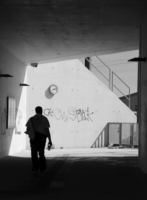
The original RAW-file was imported into Lightroom, cropped, converted to monochrome and exposure was adjusted. After that, the ways departed:
The version to the left was exported to JPG directly from Lightroom – without any sharpening applied (both “clarity” and “sharpening” set to zero). JPG quality was 100 – that is: no compression. The picture was downscaled from a width of a little more than 2000 pixels to 500 during export.
The version to the right was exported to Photoshop CS3 as a full size TIFF. In PS it has been downscaled to a width of 500 pixels and a suitable amount of “Smart sharpen” applied. Finally it was converted to JPG with “Save for web” with a quality setting of 70.
The funny thing is, that when you look at the version to the left, there is a distinct halo around the person in the picture. The better your screen is, the more visible is the halo. This is normally a sign of over-sharpening and/or too much compression. But this picture has neither been sharpened nor compressed.
The version to the right has no halo – even though it has been both sharpened and consequently has much better defined details. The effect is very obvious in this case; however I have seen it in various degrees in a number of JPG-conversions from Lightroom.
It is well known, that unpredictable shift of hues can occur when exporting to JPG from Lightroom. It happens, because the program automatically converts from its internal colour-space, ProPhoto, to the more “narrow” sRGB colour-space. In itself, this is good – but the problem is, that as a user you have no possibility to predict the outcome of the process. You just have to cross your fingers and hope for the best…
But, as demonstrated, there seems to be other problems too. I’m not at all an expert, and I don’t know if this is another variant of the colour-space issue, if it’s a result of a poor downscaling algorithm – or something completely else.
Of course it might just be me, who doesn’t understand how to use Lightroom in the right way. But since the halos appear, even with sharpening and compression set to zero, I can’t see how they can be avoided? The only way to make absolutely sure, that your JPG’s are of maximum quality, seems to be the Photoshop way…
Adobe has recently released Lightroom 2 Beta. I have tried it – and established that JPG conversion is still just as shabby as in version 1.4.1. Am I the only one who thinks, that Adobe should be able to do a better job?
Mener du ligefrem, at Lightroom tilfører en op-peppende effekt i jpg – sådan a’la Det tredie Krydderi indenfor madlavning og Loudness indenfor musik?
Har Pentax ikke leveret noget software eller en plug-in til konvertering. Det kunne da være ganske interessant med tre udgaver af billedet.
…ja – og som begge dele gør det kun resultatet værre!
Jo, Pentax har skam sin egen RAW-konverter (som de har købt af Silkypix). Men selv om det sikkert er udmærket til lige netop RAW-konvertering, så mangler det masser af funktioner i forhold til Lightroom – vigtigst af alt en ordentlig billeddatabase.
Nogle af dem, der er trætte af Resize-halos i Lightroom bruger åbenbart Denne plugin: http://timothyarmes.com/lrmogrify.php Men den har du måske afprøvet?
Tak for tippet! Det ser unægtelig voldsomt interessant ud. Det vil jeg afprøve snarest muligt – vurdering følger…..
Så fik jeg afprøvet LR/Mogrify – og er begejstret 😉